save our springs
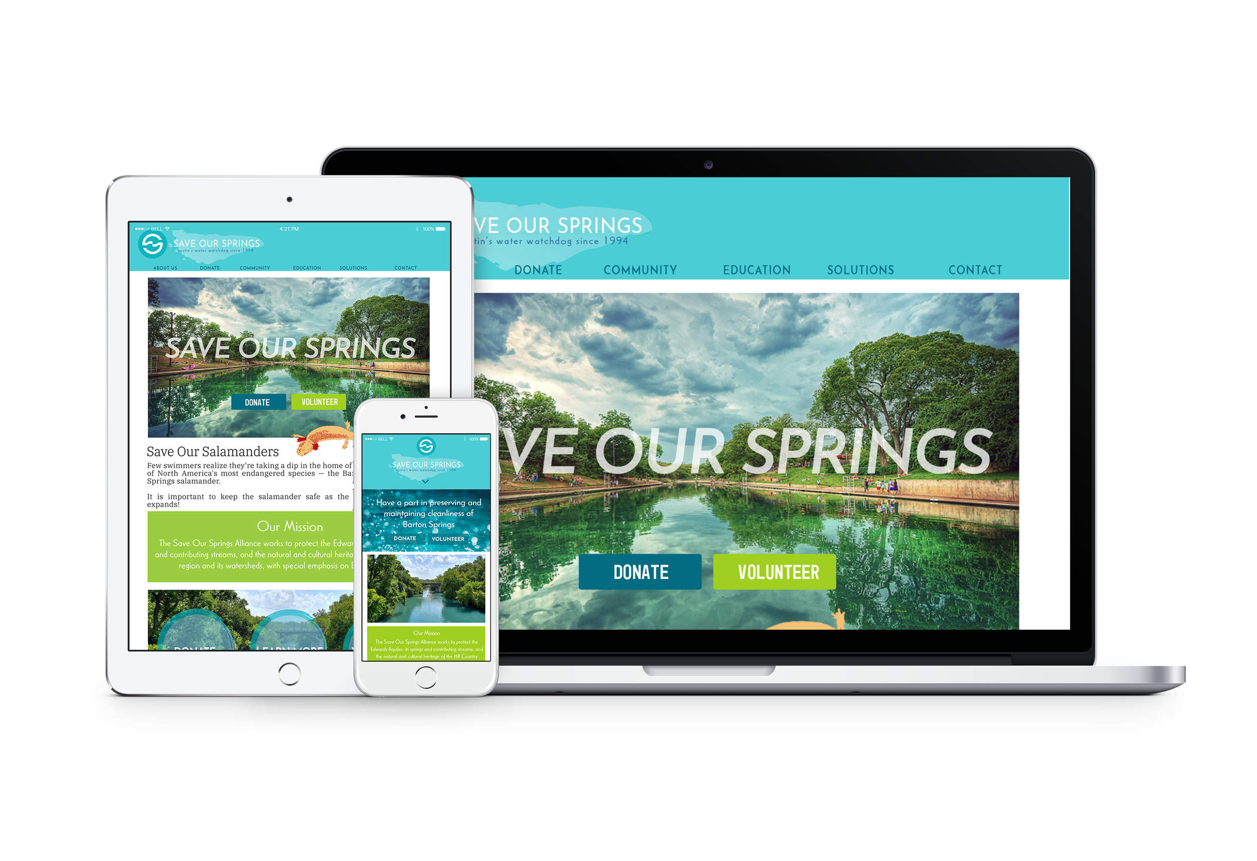
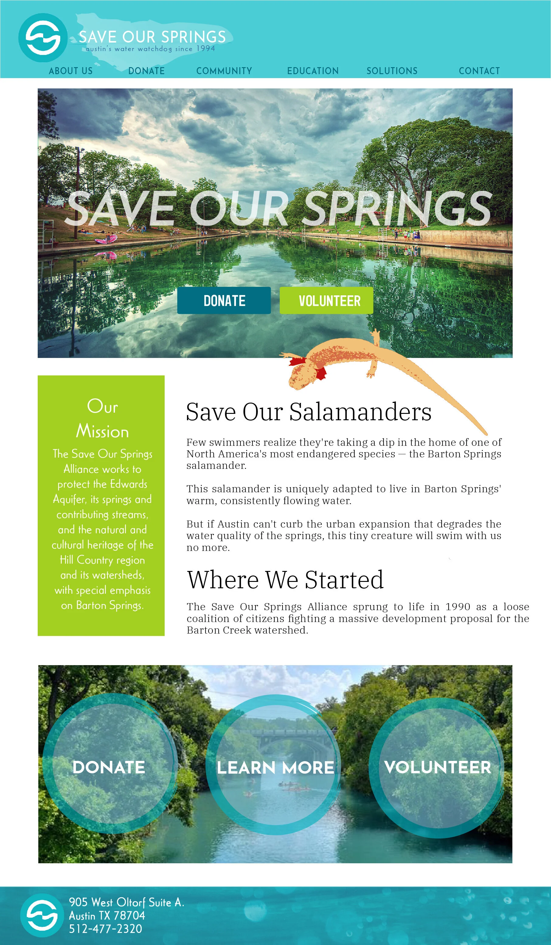
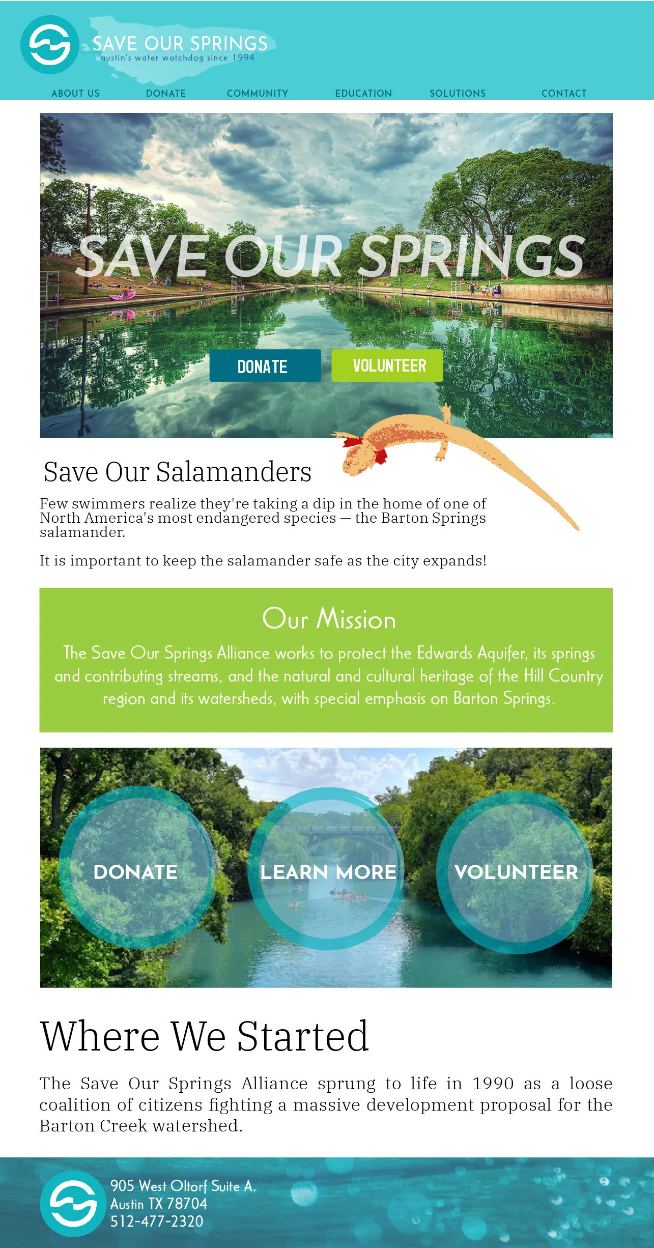
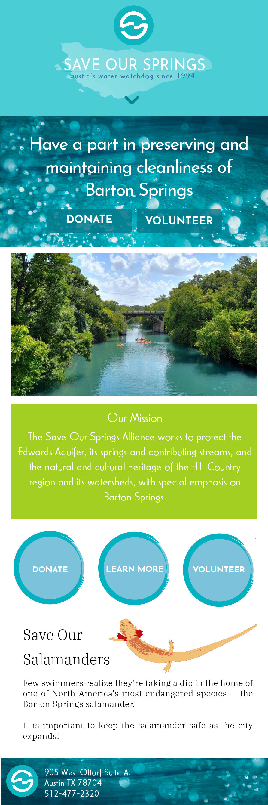
a web facelift for save our springs for a more user-friendly website that catches the viewers eye with saturated photos and color scheme.
The previous website was difficult to navigate because it was overcrowded with text, so I focused on keeping text simple on the main page with using the main idea as a headline to allow the viewer to choose if they want to read the whole article. By doing this, the information is still accessible, but isn’t overcrowding the main page. I also focused on having easy to use call to action navigation buttons throughout the site. Because Save Our Springs is a non-profit, it was important to incorporate easy-to-use donation buttons throughout the site.
shown below adapted for laptop, tablet, and mobile