Green Planet
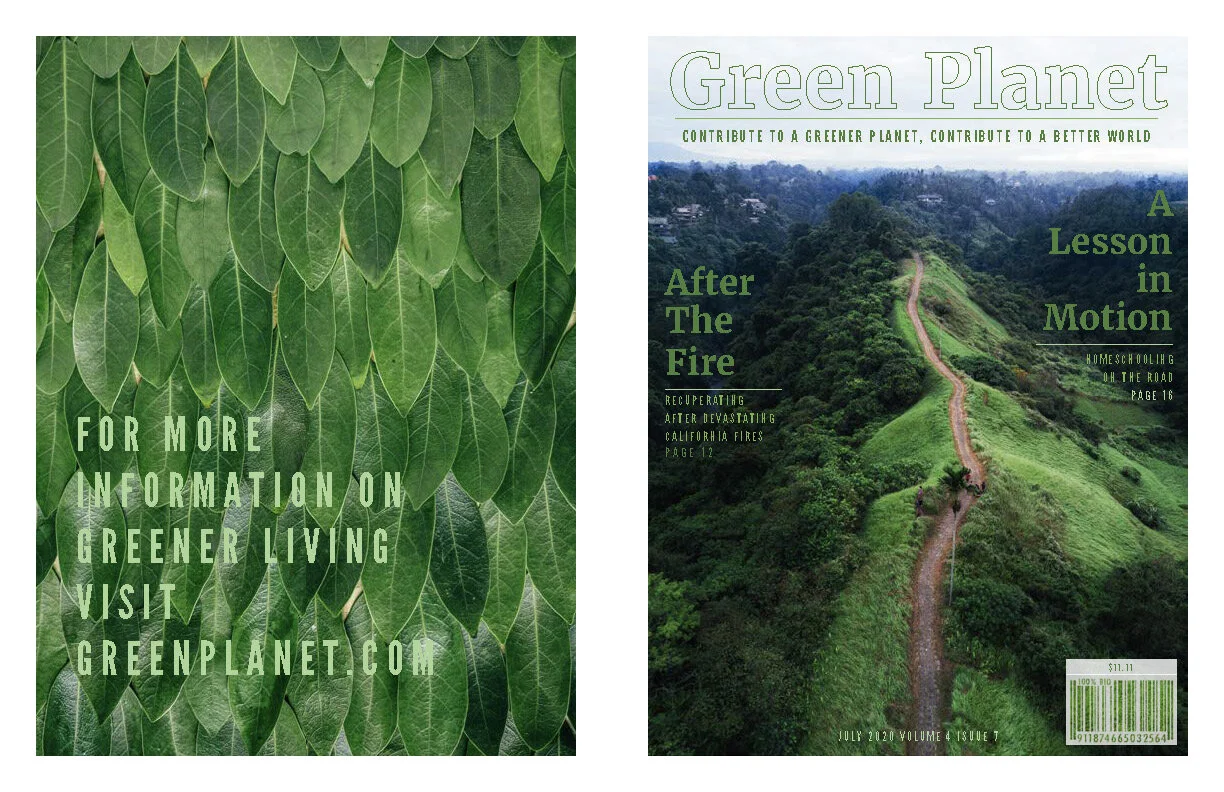
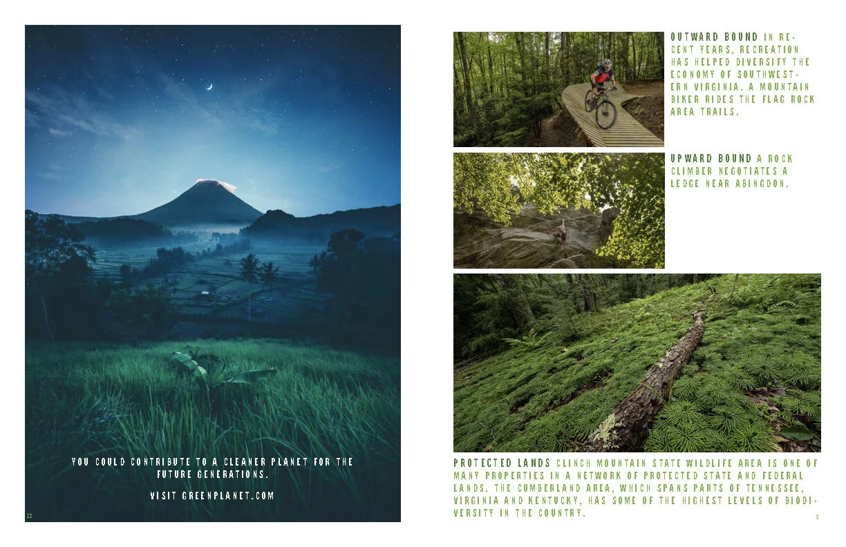
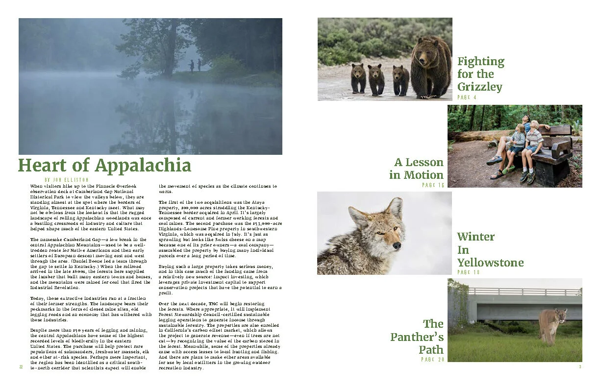
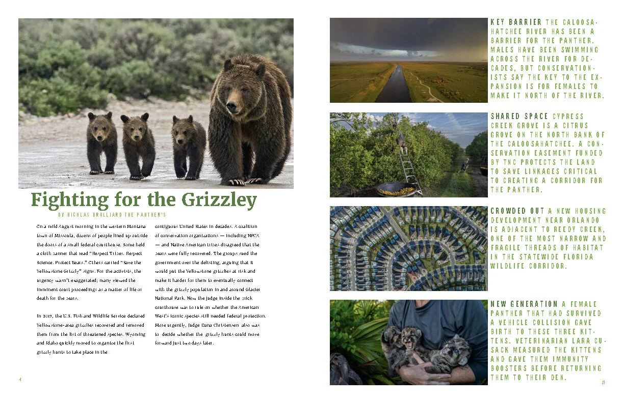
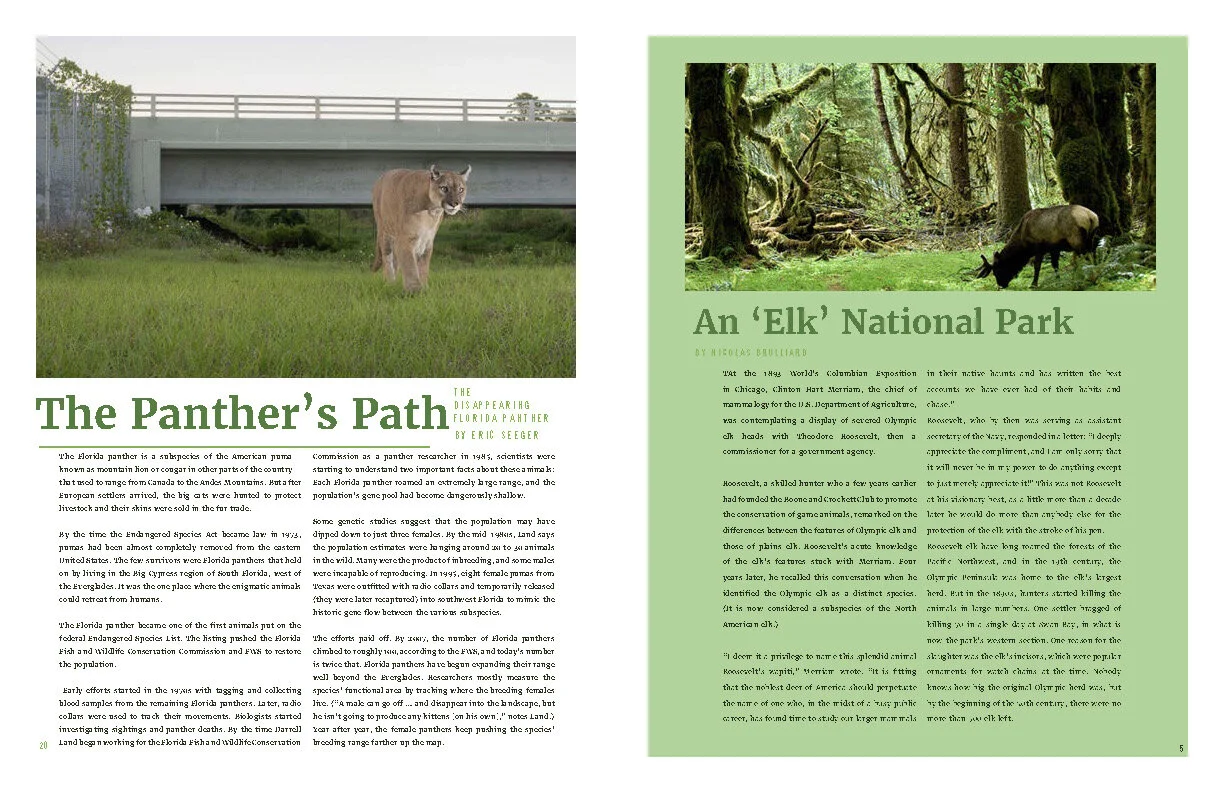
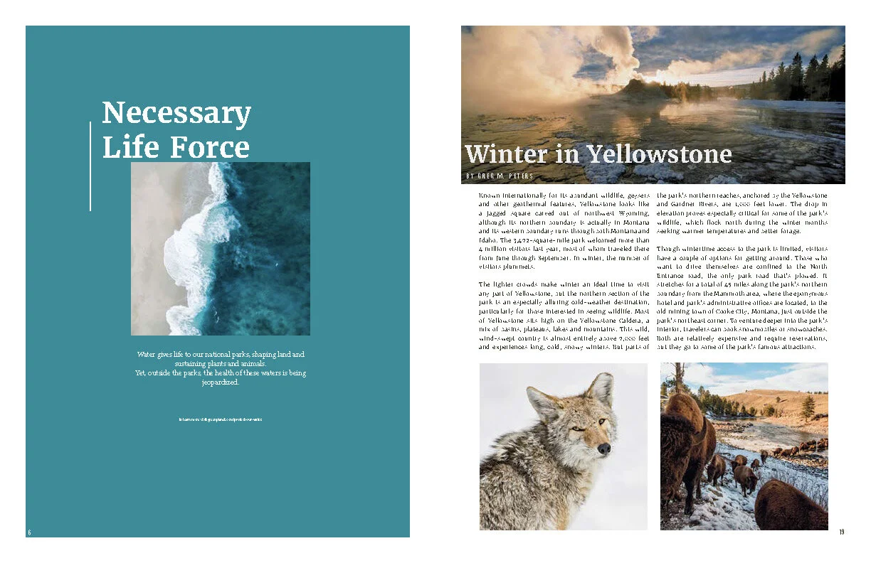
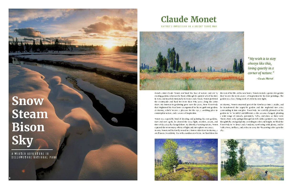
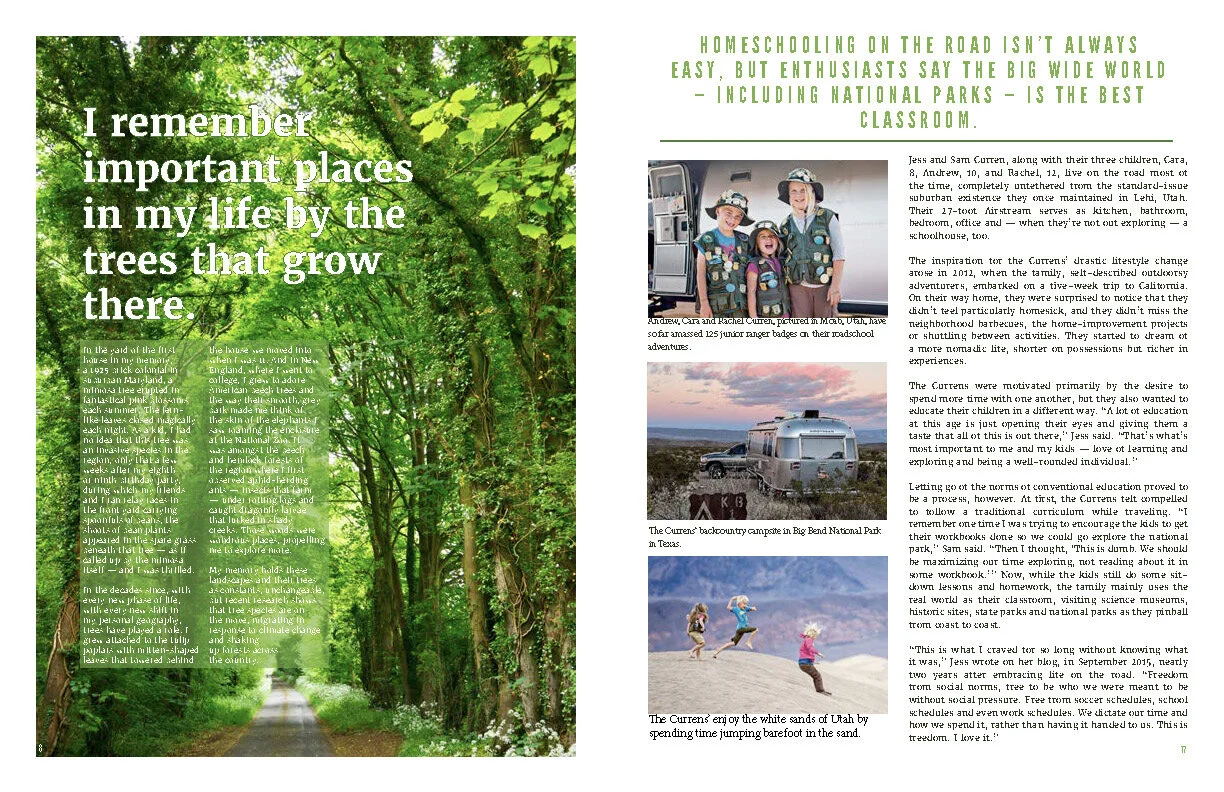
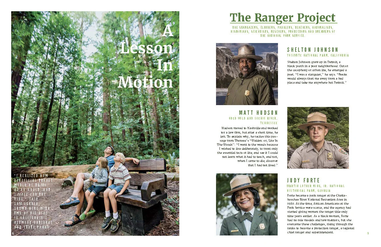
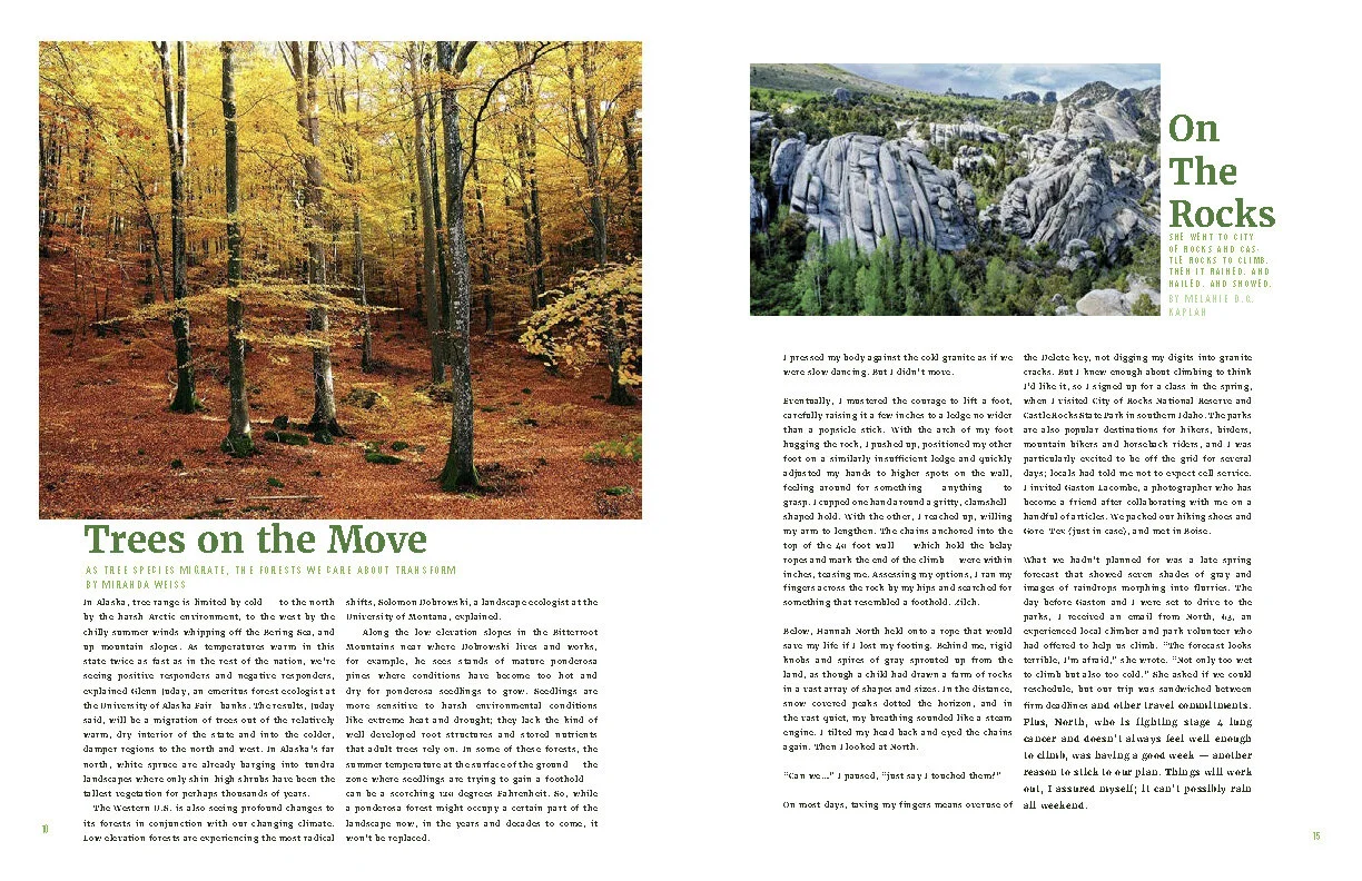
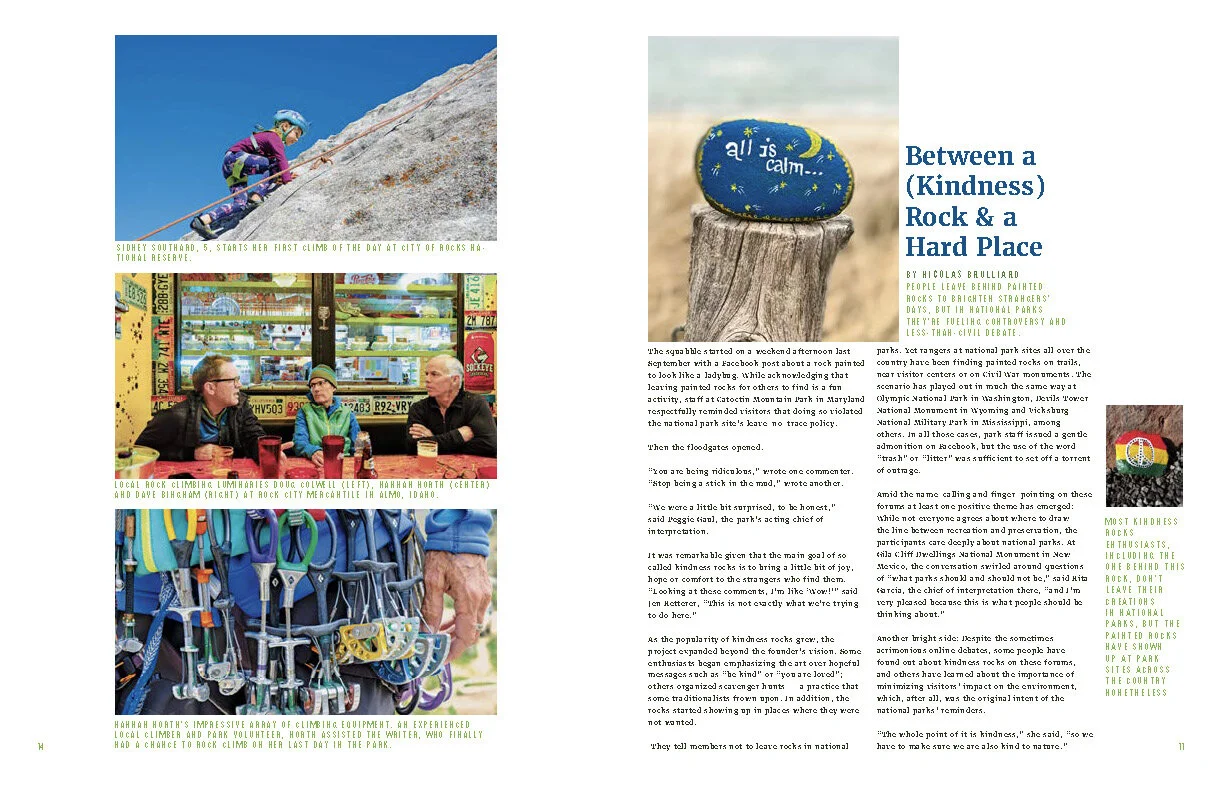
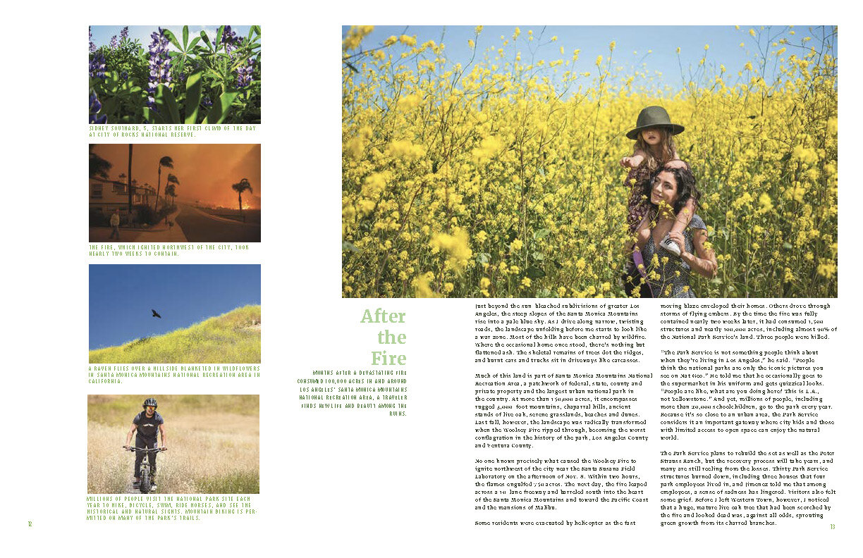
This is a magazine I conceptualized to further my understanding of typography in the magazine format. I have a strong interest in nature, so I chose to create an environmental magazine. I find that nature is simple & complex, yet always seeming to find a graceful balance between the two. With this in mind, I focused on making the layout sleek & informative, utilizing the negative space to let the viewers eye move about the page. I also focused on typography that would harmoniously work to accentuate the imagery instead of dominating the space.
I was working on this project as a study of design. The images and photographs are not my work. I would also like to point out that the pages are in publishing order, meaning that full spreads are not accurately represented.